
Mosaics
Principal Announcements
Each year, I’ve designed and produced visual assets announcing our new class of principals. What began as single announcement posts has evolved into a comprehensive creative campaign celebrating leadership across the district.
Over the past two years, I helped expand the project into a weekly feature series highlighting 5–6 principals at a time, each paired with personalized fact cards and mosaic-inspired imagery for our intranet platform. These enhancements elevated engagement, strengthened visual consistency, and brought greater storytelling depth to each principal’s introduction. Below, you can see the evolution in design, structure and branding.
2025 Evolving the Campaign Experience
For the 2025 principal announcement campaign, I designed a cohesive visual series that celebrated our graduating principals and introduced new leadership in a fresh, engaging way. The campaign launched with a kickoff post recognizing all principals, then unfolded into a six-week feature series spotlighting individual team members. Each week combined personalized quote cards and mosaic-inspired visuals to create dynamic,
story-driven graphics for our intranet platform. The result was a visually unified campaign that balanced storytelling, recognition,
and design innovation.
Mosaics: Original Announcement through Week 6


Internal Quote cards


2024 Unified Multi-Platform Design
In 2024, I developed a cohesive visual system for our internal weekly announcements introducing new principals, featuring 41 leaders. This campaign marked the first year we extended our internal designs to collaborative LinkedIn posts, aligning both platforms through our refreshed brand palette. I created the live announcement template featuring all headshots, designed to accommodate our expanded class size while maintaining visual clarity and balance. The 2024 design leaned into a refined charcoal grey foundation, accented by aqua and coral highlights, and introduced a special exception for using colored headshots—adding warmth and personality to the series. Together, these elements established a strong, unified look that connected recognition, brand storytelling, and design precision across platforms.
Mosaics: Original Announcement and weekly breakdown samples


Linked In social posts


Internal quote cards


Live (Intranet) examples


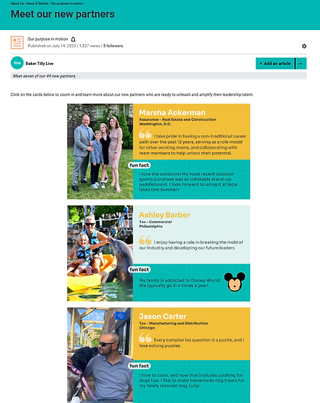
2023 Transition to a New Brand Identity
In 2023, I designed internal graphics announcing 44 new principals—one of our largest classes to date. This campaign carried forward the established layout and structure from 2022 while introducing our refreshed brand palette for the first time. The designs featured bright, energetic colors that reflected the excitement of new leadership and marked a visual transition into our updated brand identity. The 2023 campaign served as an important bridge between legacy layouts and the more cohesive visual system developed the following year.
Mosaics
.png)


.png)

Internal Quote cards & Live (Intranet) examples
.png)

2022 Partner Announcement Campaign
As part of the Communications team, I designed visuals for our largest graduating class of new partners (then the term used for principals). Working under the Communications Director’s creative direction, I aligned designs with existing departmental standards while introducing the growth symbol outline—its first use in our brand system. This foundational campaign established the visual language that future years would
build upon.
Mosaics


Internal Quote cards & Live (Intranet) examples


2021 Building Consistency and Form
By 2021, the campaign introduced a more structured internal rollout featuring weekly write-ups accompanied by small supporting graphics. The mosaics used at this stage were early, simplified concepts that laid the groundwork for later refinements. Using our original green and black branding, the visuals maintained consistency while beginning to explore greater texture and depth in presentation. Though modest in scale, the 2021 campaign represented an important step toward the more dynamic, story-driven designs that would emerge in later years.
Mosaics


.png)
Internal graphics


2020 Partner Connect Alignment
In 2020, the announcement campaign was designed to align closely with the Partner Connect event’s style and imagery, creating a cohesive brand experience across internal and external channels. The smaller class size allowed for individualized posts featuring single face-card and title graphics rather than weekly series. This year also marked our only video-based external announcement, showcasing partners through motion and storytelling for the first time.
Mosaics


Internal graphics


External Linked In post
2019 Launch on the Live Intranet
2019 marked the first year our partner announcement campaign appeared on the Live Intranet, establishing the foundation for what would become a long-term digital recognition series. The visuals featured our original black and green color palette with clean square headshots, reflecting the early design system of the Baker Tilly brand. This initial structure set the stage for future refinements, as the campaign evolved to more fully represent our growing team and visual identity.
Mosaic


Internal graphics

